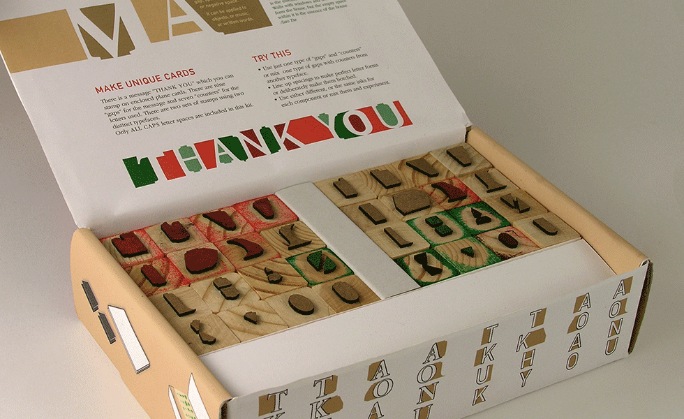
ma (Japanese) means gap, space, pause, or negative space. It can be applied to objects, or music, or written words.
How can someone learn typography by comparing counters and gaps instead of letter forms? This stamp kid allows shaping of words by using counters of two distinctly different typefaces.
DIN is sans serif font designed in Germany in 1936. Its name is an acronym for Deutsches Institut für Normung (German Institute for Standardization). It is a very geometric typeface.
In contrast, GARAMOND is an old-style serif typeface named after Claude Garamond, who lived in (c. 1480–1561). This font is very fluid and elegant. It is also considered the best for legibility.
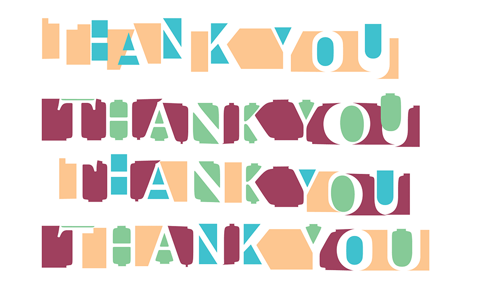
This is how one can use this kit: Use just one type of “gaps” and “counters” or mix gaps from one typeface with counters from another typeface.
Line up spacings to make perfect letter forms or deliberately make them botched.
Use either different, or the same inks for each component or mix them to experiment.
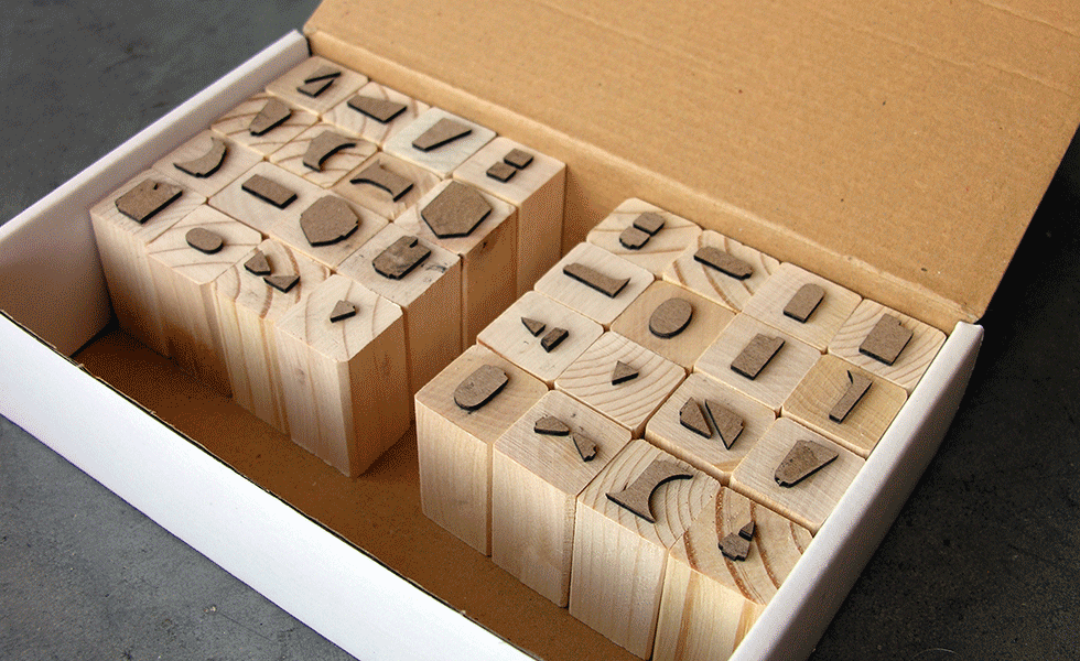
MA is not only useful teaching tool, one can make unique cards with it. There are nine “gaps” and seven “counters” for the letterforms used. There are two sets of stamps that utilize two distinct fonts. Only ALL CAPS letter spaces are included in this kit.